I have decided to start off the research for the wind in the willows cover by looking at what covers have been done before.


These covers are both done in a very illustrative style. The one on the left seems more modern than on the right. I prefer the more classic style on the right, but I dont think either of the covers are that eye catching for the child.

This style of cover has used very life like 3d drawings or what could be puppets. I dont like this cover I think it looks quite creepy. There is also no excitment to the chracters they all look quite sinister and sad, which would not compel me as a child to read it. This is a style I will definitley be avoiding.

The above style of cover works alot better than the previous. It has an air of class and manages to set a lovely whimsical feel. The characters of the book look interesting and like they are interacting with one and other which makes you want to know who they are? what they are doing? why? which makes you intreeged and want to read the book. This is what I want my design to do, I want the audience to be intreeged and want to read the book to ring out more.

I think the above book cover is very beautiful, but would not be suitable for children as it is a little too classic. This would be a perfect cover for a collectable book or an addition for adults.


more examples of covers above.
Original illustrations :
To get a better feel for the classic book I looked at the original illustrations done for the book. They are done by water colour and have a lot of character. The illustrations are very iconic and unique to the book. I really love the colour palette used for the illustrations too, the cleaver use of pastel colours with some bolder colours works really well.


I will experement with my concept by using water colours as I think this would be a good way to play homage to the classic feel of the illustrations.


These are some other illustrations of the book. The one on the left doesn't apeal to me as much as the orignial illustrations, I think it give more of a film feel than an illustration for a book.
Hand rendered books :


To gain a better understanding of the hand rendered look of book design across the spectrum of book I decided to look at hand rendered books that have the audience of adults. From research I can see that the hand drawn effect is used a lot for adult books and is effective. It add alot of character to the books and makes the book look like it is more aproachable which might encourage some people to read more if it looks less daunting.
Childrens books :
To get a feel of what childrens book covers look like I have been looking at many childrens books these are a selection that I have been looking at.


A lot of the book I looked at for children are illustrated, and quite often by hand. I think this gives a more friendly feel to the covers and more entertaining for the children. This confirms that the style I am going to use for my cover will be hand rendered as this seems to be the most successful way of designing a book cover for children.
Concept research :
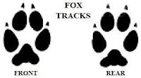
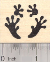
Tracks -
These are all the tracks of the animals that are characters within the book.
Animal facts :
These are the websites that I have used to get the facts for the animal fact book.


No comments:
Post a Comment