Thursday 27 October 2011

Further research for alphabet.

Ill Studio.

This is a peice of work by Ill Studio. I really enjoy the use of geometric shaps in this letterform it makes it look almose tribal or like it has a hiddent meaning, which is something i am looking to experiment with.
 
Catalogue.
 
Again for the same reasons as above i really like this typeface. It has an almost criptic feel to it.


3D fonts.


I enjoy how these two examples of 3D fonts are quite subtle there not too bulky or OTT with how 3D they are. I think this is partly due to the use of colours which is a factor I can not include in my alphabet.
 
Broken font. 


This is a good example of a way i could make an obvious separation to the two sides of my letter form, by physically taking parts out of the letter.

Zadie


This is a really lovely font designed for a book cover I really like the use of the two lines and how it is decoratvie but not overly so its very feminine looking and gentle which resembles Hannah very well. I will work on developing this font further.


LECTURE 1: Modernity and modernism


We have been asked to analyse two images compare and contrasting the similarities and differences the first image we were asked to look at was 'The uncle same range (1876) advertising image by Shumacher & Ettlinger, New York' and the second being a poster by 'Savile Lumley (1915).

At first glance the uncle Sam range advertisment is very hard to understand and follow which is a contry to the other image which is very clean and consise and easy to read into. One thing that is imediently clear in the uncle sam advert is that it is American and very proud and patriotic. The colour scheme is majority red blue and White like the flag. The curtains resmeble the American flag the clothes represent the flag the carpet the wallpaper almost everything link back to America. There is also an eagle on the table which is a big American symbol. The font used also has a very wild west American feel to it also. All of this makes it very clear that this product is being andvertised to an american audience. The poster also has some patriotic content in it but bot nearly as much. It features the English rose on the curtains and an English crest on the the sofa. These small features let us know that this is an English poster aimed at the English. Compared to the American poster the patriotic content is very subtle, as is the whole poster in comparison.

Eventually in the uncle sam poster you can see the story behind It and what is going on. The item being advertised is the cooker. The reasons behind why it is being sold in such a patriotic flamboyant way became clear after noticing the clock that says the year then, 1876 and also the year 1776, the year of indapendence day. So it is a celebration of being free for 100 years. The image features 3 children labled new England, west and Dixie which are all areas of America. The reason they are children is to show the country is young, fresh, the future and growing. There are alot of symbols in this advert that aim to show that America is a great country and that this cooker is made for the rich, such the fact that things are gold which is a symbol of wealth, another symbol of wealth is that they have a slave. There is also a big enphasis on the family feel to the advert.

The English poster has a more simple messege, direct purpose and a specific auidience. Its intent is to persuade Men, fathers inparticular to join the army. They do this by like with the american adver, uses family as a main persuading point. If the man is a father this poster will take an effect on him and make him put himself in that position mentally. It's basically saying if you don't go to war your children will down on you. Like the American advert it is obvious that this too is aimed at a middle class audience you can see this from how well presented the children, father and house are. It is also promoting England in a positive way like the American advert in the way it emphasises 'The Great war'.

Tuesday 11 October 2011

Crit for alphabet.

After having this crit i have decided to scrap the building letters through the use of repetitive pattern and look further into the anatomy of type. As i am looking at two sides to hannah I am going to look into ways of representing this in the letter form perhaps by making the font have two sides a contrast or a depth to it. I have found this crit really useful as I had gotten too lost into one idea and now I feel able to research and experiment more.

Friday 7 October 2011

House of cards - Pentagon


This is some work by Pentagon. It drew me in as the pattern is so bold and its a nice twist on playing cards. I may experiment with this way of building letters through pattern as it would be a good way to include the skulls and the rose/pattern.

Sibera


Hannaha's happiest time in her life was when she went to Siberia for 3 weeks. I'd quite like to somehow incorporate this into the candy skulls as a contrast of hannahs happiest feeling (sibera) and worst (death). From looking into Siberia the thing I want to concentrate on is the pattern in the textiles as it is very individual and I think Hannah would be able to recognize where it is from.

day of the dead


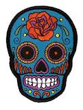
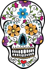
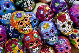
These are some images of candy skulls from the Mexican festival, The Day of The Dead. It's a day where they celebrate the remembrance of deciesed loved ones. I have looked into this as from my interview with Hannah I gathered that she was a very positive happy optomistic person but, as some of the questions were a bit dark it brought out a different side to hannah. One of the questions was 'what is your greatest fear?' Hannahs answer was 'Dying alone with regrets' where as mine was 'wasps'. So ive been looking at they day of the dead as it is a positive spin on death. The designs on the candy skulls are also really intracate and positvie which also suits Hannah.

Optomism.


When researchng the symbolism of optomism I discovered that there were quite a number of different symbolisms: a yellow rose, humming bird and turtle. Out of these three I decided the rose was the most relevent as Hannah mentioned she liked nature and flowers, so i will look into developing the idea of a yellow rose futher.

Tuesday 4 October 2011

Mosieur Cabinet LOVE HATE TASK

Monsieur cabinet is an illustrator based in Leeds. I really enjoy the way his work is so stripped down. He experiments with negative space and how far he can strip the work down without it loosing it's meaning. I also enjoy the simple but very accurate line drawings which are at the same time pretty complex. He also uses a really lovely colour pallet of pastel colours which I feel compliments and works with his work style well.


Mercy LOVEHATE TASK

This is a really nice piece of work by mercy for band the old romantic killer band. It focuses on a hand rendered look as the band 'doesn't like computer' I think they have achieved this look really well.


Andrew b myers LOVE HATE TASK


I really enjoy the work of Andrew B Myers I like the way it is humorous and witty and takes everyday normal objects and transforms them into something new.

Ill studio LOVE HATE TASK

This is some really interesting work by ill studio it's a clever and eye catching way to display t shirts rather than just your bog standard coat hanger. The use of colour and lighting also works really well in these compositions

Hello me LOVE HATE TASK

I like this series of work by hello me. It's a really interesting way to look at a bouquet of flowers and the simplicity draws me in to the flowers more and make me notice how beautiful they are. As a cd cover and poster the image also works well as it is so striking .