
For this brief we have been asked to design a beer label for the Leeds Brewery ale 'Hell Fire' that is specifically for Leeds college of Art's network event 'Creative Newtwork'. The brief states the design should be :

so I will research into beer label design that captures these things.
Creative Network branding :
The brief states that the beer label must complemnt the CN branding.

The branding is very clean and simple but effective, it is recognisable and I think that it should be recognised in the label design either by using the colours or featuring the design.
Leeds Brewery branding :


The above is the branding for Leeds Brewery this must be on the bottle somewhere. or be left placed on the neck of the bottle as they place it on their bottles.
Product - Hell Fire :


This is the branding for the Hell fire beer that Leeds Brewery developed. It is colourful and friendly and depicts flames which represents the 'fire' side of 'hellfire'. Although there is an illustrative element to the design the main focus is the typographic, which is an unusual and striking design for beer.
Other beers :
To get the feel of Leeds Brewery I have looked into there other branding for beer.

The branding for Leeds Brewery's draft ale is a lot more traditional than the HellFire, and this is due to Leeds brewery wanting to extend their audience as the most popular beer they sell is on draft in pubs, so they want to extednd there audience to people who buy bottled beers which is a more modern thing.


More example of Leeds Brewery's bottled beer, a little more traditional than the hellfire design which shows that the hell fire beer is a new modern beer for leeds brewery compared to their other beers.

Beer Packaging :
Bellow are exampled of innovative designs for beer packaging and labelling.

This beer packaging has a very contemporary feel, through the use of typography and the simplistic design with the all white bottle it is very striking and is different from a lot of the design you see on the shelfs.
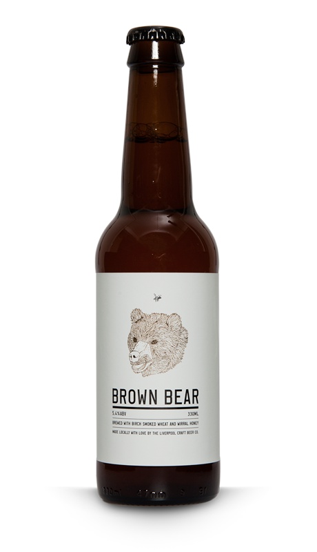
This design using a simplistic illustration is effective. The typography is simple to match the illustration and used together with a white background makes this label striking and would stand out in a row of normal beer bottle designs on a shelf.

The design for this label isnt that effective but I think the use of a fassening for the label is interesting, it makes the label more than just a beer label, as there could be anything on the other side. This teamed with an effective striking design could work really well as a concept.

This beer bottle is very effective. It is creative and innovatative and also humourous which will draw alot of people in to look at it and there fore buy it. This type of cleaver design works really well and it something worth experimenting with.

I really like the used of the dicut of the sticker, showing through the contents of the bottle this could be aplied to many different interesting concepts. It has been excecuted well here with the mexican nacho libre masks and makes a striking beer bottle design.
Networks :

As I want to draw upon the network feel of the event I have looked at the definition of network to get a better understanding of it.

I also wanted to see what visially came up when I typed in network into google image search the outcome was interesting and very computer / tech based.
No comments:
Post a Comment