What skills have you developed through this module and how effectively do you think you have applied them?
Throughout this module I feel there are a number of skills I have developed. I now feel more comfortable analysing work in an academic way, I know which language is appropriate to use in analysis and have also been shown many ways of analysing wrok successfully. These are qualities that have proven useful when applying them to DP crits. I have also learnt more about myself as a designer from Jo's sessions and extended my knowledge of other designers.
Through the publication brief I feel I developed better skills in researching in books for content, as this was such an important ingredient to the publication
What approaches to/methods of design production have you developed and how have they informed your design development process?
For the publication I used Indesign and illustrator, so I have developed my skill in them. When I do illustration I usually hand draw them, but for this publication I wanted to try something different so to learn more about illustrator I decided to use it for the illustrations for this publication. I also experimented with layout more in this publication as I didn't want to just list words as it would look dull and ordinary.
What strengths can you identify in your work and how have/will you capitalise on these?
I feel I have created a publication that is useful for my target audience with appropriate content, this is from extensive research which has highlighted to me the benefits of appropriate research. I feel I now have a greater understanding of audience and how important it is to view what you are designing from their point of view as it was interesting to see in the final crit just how confusing work can be, and the smallest alterations can make the work read clear. Work has to speak for itself, and that is something I am going to remind myself constantly.
What weaknesses can you identify in your work and how will you address these in the future?
I need to have a greater understanding and knowledge of theorist as this is something I really struggled with throughout context of practice. I also need to work on my academic writing skills for the essay as I feel I am still not very good at it.
I feel the finish and to my publication could have been a little better as it got scuffed towards the end, I need to make sure I am very carful with my end products so that they read as I want them to. I also need to work on photographing my work appropriately. I also need to check my work more thoroughly as it was pointed out to me in the final crit that my publication was full of spelling mistakes.
Identify five things that you will do differently next time and what do you expect to gain from doing these?
1. develop my academic writing skill so that my essay next year wont be such a struggle
2. Inform myself more of theorists out there so I can gain a greater understanding of them.
3. Inform myself of areas of Design context that I am interested in so that I can further my knowledge
4. Check my work for errors before I submit it for final crits
5. Be more orginised with lecture notes, notes from sessions etc as this will make bloging alot easier
Attendance - 4
Punctuality - 5
Motivation - 3
Commitment - 3
Quantity of work produced - 3
Quality of work produced - 3
Contribution to the group - 4
Tuesday 22 May 2012
POSTMODERNISM
http://gds.parkland.edu/gds/!lectures/history/1975/postmodern.html
http://www.emigre.com/Editorial.php?sect=1&id=20
http://www.amazon.co.uk/No-More-Rules-Graphic-Postmodernism/dp/1856692299
The above links have really helped me get a greater understanding for postmodernism within graphic design
http://www.emigre.com/Editorial.php?sect=1&id=20
http://www.amazon.co.uk/No-More-Rules-Graphic-Postmodernism/dp/1856692299
The above links have really helped me get a greater understanding for postmodernism within graphic design


REVISITED ESSAY
Could it be argued that fine art ought to be
assigned more 'value' than more popular forms of Visual Communication?
This essay
will look at the assigned values of Fine art compared to Visual communication
and whether all ‘Art’ deserves the prestige name and value it has gained. The rivalry between the two
disciplinary has been ever live. Both have strong points and weak points within
them, which will get explored in this essay.
Before technologies, what gave art high value was how unique it was. A
painting could only be in one place at one time, meaning its audience would
have to travel to experience it. This gave art a very specialised, elite
audience and made their experience rare and unique to that person. This is not
true for graphic design as design is everywhere, you do not have to travel to
see it. The audience for graphic design is not specific or elite, it is the general
public, which technically means graphic design is of less value. This elite art
vs. everyday graphic design argument could have been a strong argument proving
art has more value, but due to the production of technologies, it is true no
more.
‘The painting on the wall like the
human eye, can only be in one place at one time. The camera reproduces it
making it available at any size, anywhere, for any purpose.’ (S. Berger, 1972, ways of seeing
ep 1, 3.23)
Berger makes the point that due to the advance in technologies, art is
no longer for the elite; it can be accessed by the masses. You no longer have
to make that special effort to go visit it, you can view it in your house, on a
screen, you now see art in the context of your own life. The fact that art is
now available for the masses decreases its assigned value, and makes it on par
with graphic design. Art is no longer something that you need to travel to see,
art now comes to you.
Another argument about what makes something valuable is the longevity.
If something has more of a long lasting meaning or presence it is said to have
a higher value.
‘The argument to be considered
here is that fine are and graphic design are different from each other because
art is culturally more significant than graphic design. Where art is perceived
to be of lasting value, graphic design is said to be ‘ephemeral’ (Cronan 2000:
216).’ (Barnard, 2005, pg165)
This is saying that art is more valuable than graphic design as it had a
lasting presence, where as graphic design is something that comes and goes and
is ever changing. This is still true today in the sense that the product of art
is permanent and the product of graphic design can be impermanent, such as
flyers or packaging, but there are more cross over’s today. Graphic design
posters, such as advertisements or music posters are getting more popular to have
in the home. The longevity of the meaning is also increasing within graphic design
as graphic design gets more popular, graphic products and campaigns are
becoming more memorable. Art however is going the opposite way. Art is becoming
more conceptual and less permanent; it is more about the idea then creating a permanent
piece of art.
When it comes down to it today, the thing that influences the value of
art on such a high level is money.
‘I don’t want to suggest
that there is nothing left to experience before original works of art except, a
certain sense of awe because they have survived, because they are genuine
because they are absurdly valuable, a lot more is possible but only if art is
stripped of the false mystery and false religiosity which surrounds it this
religiosity is usually linked with cash value. ‘ (S.Berger, 1972, ways of
seeing ep 1, 2:39)
Berger is stating that the money value of the artwork has taken over the
underpinning value of art how it used to be viewed. With this barrage of false
value from the money you cannot determine the actual value of the art unless
you strip it back and get rid of the money value. This is something that would
never happen today, money has become too much of an importance and poignant
part of life today that it does now underpin and state how valuable a piece of
art or graphics is.
Tracey
Emin is an example of an artist who is seen as and is very ‘valuable’, but this
is up for debate. Her pieces lack
value in the sense of skill. The pieces she does are all very much concept
based. Her work is not beautiful or unique but it does evoke a reaction, be it
disgust, confusion or dismay. The piece that has caused controversy is ‘my
bed’. Is it art? Is it not art?
‘The objects that provoke
this emotion we call works of art. All sensitive people agree that there is a
peculiar emotion provoked by works of art. I do not mean, of course, that all
works provoke the same emotion. On the contrary, every work produces a different
emotion.’ (Bell, 2008,p1)
According
to the theory of Clive Bell, it is art. But does it have value? Charles Saatchi
bought the piece for £150,000, and
by doing so he added value to the piece physically and psychologically to the
public.
‘Charles's achievement here
was massive in almost every sense. He invented a new movement – something every
critic and curator dreams of doing.’ (Lewis, B, 2011, p1)
Saatchi’s name has such power and respect that
he is able to buy the work of the likes of Emin and Damien Hirst and in turn
transform their work and them into almost celebrity figures with the value of
their work escalading to unthinkable prices. So is the real value of Emin’s
work completely down to Saatchi, How much would it have been worth if it wasn’t
for him investing in it? As for the value of the art itself, is that truly
there if it is aimed at such an elite audience to appreciate the ‘art’ as art
and not just a reaction piece.
A recent piece of graphic design that like
Tracey Emin’s work has a debatable value to it is the 2012 Olympics logo for
England. This logo has been under scrutiny ever since it was released, this has
definitely brought attention and interest to it, but unlike in fine art not all
attention is good. In graphic design, the object must serve the function and
therefore if it is seen as bad or un readable, the designer has failed to
achieve the outcome. The 2012 logo has a lot of value generated for it, like
Emin, from the name it was invested by. The Olympics is a prestige, world wide,
renowned and respected event so this adds value to the logo right away. Value
is also added by the fact it is representing it’s country. But just because it
has a high ‘value’ does not mean the piece is worthy of it.
‘The Olympics should exist
to raise our collective hopes, expectations and sights. This logo, though, is
one of the saddest modern sights of all, and this from a city that produced the
rightly world-famous London Transport logo. There are no medals here.
Only "rubbish".’ (Glancey J, 2007, p1)
The designers were paid £400,000 for this logo,
so again this adds literal value to this piece of graphic design, they were
paid so highly not because the piece was worth that much but just because of
the name, which is the same scenario as Emin and Saatchi.
The Logo does not represent the grand event
that is The Olympics coming to England. If you were to take away the five
Olympic rings in the ‘0’ you would not be ale to see the Olympic connection, again
if you take away the London in the 2, you would not know where the Olympics is
happening, For £400,000 you would expect these things. There is no visual value
to this logo.
So which is the rightful owner of being seen as
having more value, graphic design or fine art? Neither. Value is a word corrupt
these days by money, just because a piece of art or graphic design has a high
value does not mean it is valuable in the sense to society. The most valuable
art and graphics is the stuff that we can understand at face value, appreciate
and admire, and both go hand in hand. Although Graphics may be more functional
and always has an aim, so in that sense is very valuable. Fine arts function is
to entertain people and look good, which can also be the aim of graphics. They
overlap. Value is in the quality of the work what ever that may be, just
because it is art does not make it valuable, just because it is graphic design
does not make a piece valuable. If a piece is innovative and conveys whatever
the artist/designer wants to portray in a beautiful and clever way that is what
makes either disciplinary valuable, not money, not status.
Bibliography
Barnard, M. (2005). Graphic design and art. In: Graphic Design as communication. Oxon:
Routledge. p162- 179.
Bell, C. (2008). The
aesthetic hypothesis. Available:
http://www.kelake.org/archive/art/the-aesthetic-hypothesis-clive-bell.php. Last
accessed 22nd Jan 2012.
Glancey, J. (2007). How
Lisa Simpson got ahead at the Olympics. Available:
http://www.guardian.co.uk/artanddesign/artblog/2007/jun/05/howlisasimpsontooktheolym.
Last accessed 22nd Jan 2012.
Giroux, A. (last modified 2011). My Bed, 1998, Tracey Emin. Available:
http://www.alexandragiroux.net/my-bed-1998-tracey-emin/. Last accessed 22nd Jan
2012.
Kettle, M. (2012). David
Hockney is still an artist who genuinely matters. Available:
http://www.guardian.co.uk/commentisfree/2012/jan/18/david-hockney-artist-matters.
Last accessed 22nd Jan
Lewis, B. (2011). Charles
Saatchi: the man who reinvented art. Available:
http://www.guardian.co.uk/artanddesign/2011/jul/10/charles-saatchi-british-art-yba.
Last accessed 22nd Jan 2012.
Oxford Dictionaries. (last modified 2012). Fine art. Available:
http://oxforddictionaries.com/definition/fine+art. Last accessed 19th Jan 2012.
Berger, S (2008) ways
of seeing (first episode) ¼, youtube, available: http://www.youtube.com/watch?v=LnfB-pUm3eI&feature=relmfu
. Last accessed 19th May 2012.
Berger, S (2008) ways
of seeing (first episode) 2/4, youtube, available: http://www.youtube.com/watch?v=peONDtyn8bM&feature=relmfu.
Last accessed 19th May 2012.
Berger, S (2008) ways
of seeing (first episode) 3/4, youtube, available:
http://www.youtube.com/watch?v=3vHrRvsXBkM&feature=relmfu. Last accessed 19th
May 2012.
Berger, S (2008) ways
of seeing (first episode) 4/4, youtube, available: http://www.youtube.com/watch?v=XShzabEv8bM&feature=relmfu
. Last accessed 19th May 2012.
DC PUBLICATION - crit feedback


From my crit feedback It was clear that I needed to make some adjustments such as spelling mistakes. I also need to make a smaller book for the words as this is something that has been mentioned in this crit and that I think would be useful. other things to address are the belly band and more info in the tips book.


I had planned on making a keyring of words before the final crit but ran out of time, so I am glad it was something that was brought up as I now know that this smaller booklet of words is essential.

I have also decided to add more content to the tips book, at first I didn't want it to be too overpowering filled with tips but as my audience has now said they'd want more tips i am able to use more that I generated from my research.


When I looked at the cover of the booklets it made me feel really negatively towards them, like they looked dull and boring because of the grey ( even thought I love the colour grey, the mixture of grey with academic booklets really didn't work) So i have decided to add a cream colour into the equation, which is a lot more fresh and alive and stands out more as there is a higher contrast between the black and cream. I will still keep elements of grey as I feel the cream and grey work in unison and make the finished outcome look professional like context of practice should be. I have also added a brief intro page as this is something that was suggested in the crit.


BIBLIOGRAPHY
Barnet, S (2008). A short guide to writing about art. 9th ed. pearson: pearson hall.
Lupton E (2011). Graphic design thinking beyond brainstorming. new york: Princeton architectural press.
Lupton E, Miller A (1999). Design writing and research. new york: Phaidon press limited.
Moody, S (2007). Dyslexia surviving and succeeding at college. oxon: Routledge.
DC PUBLICATION FINISHED


I am overall happy with my publication, although I do have a few queries about it such as the grey coloured cover and whether I need more info in the tip book, hopefully things will get answered in the crit.
DC PUBLICATION - design development
To start with I couldn't decide how I wanted to arrange the words in the book. I had a play on a piece of paper and decided that I definitely wanted the words to be spaced out from one and other so that the words don't overwhelm the reader or become too much. I then remembered some of the feedback from the crit that I should find a way of categorising the words such as positive and negative. I decided this would be a good idea and again started drawing on paper how to separate the words. I then came up with putting + sign for positive and - sign in the actual layout to stand for positive words and negative then / sign for neither positive of negative but a good describing word. This will hopefully work well as it will be a subtle way of saying that the words are positive or negative without having to write anything at the top to confuse things. It is not immediately obvious but once you start reading the words and realise they are all positive or negative itt becomes more apparent.


Above the overall layout for the book of words.

above layout of the belly name.


this is the layout for the tips book. I wanted the tips book to be as illustrative as possible so that it remains interesting for my audience who are a visual audience.
DC PUBLICATION - DESIGN SHEETS


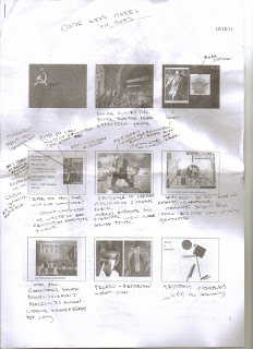
Above is the range of publications that I have been looking at for my book. I want the style to be as simple as possible, but at the same time have an essence of fun so that the subject I am doing isn't too daunting.


Possible design ideas.

Before the crit Jo asked us to analyse our own work so that we had a greater understanding of it before we went into the crit. This was useful as it made me more focused and clear on exactly what I want to achieve.
My feed back from the crit was positive everyone said that it would be something that they would personally find usefull, they all reiterated the fact that it would have to look light hearted so that it doesn't bore the audience. and suggested a smaller sized publication for students to have on them at all times.
DC PUBLICATION - RESEARCH


From reading the above 4 books I was really able to gain a greater understanding into academic writing, how to improve it and how to apply word to it. I was able to form list of the most useful tip from reading the books, which I will use in my publication.
I now need to generate all the words for the publication by examining Year 1 graphic deisgn CP blogs. I have decided this is the best way to go about it as then the words a specific for graphic design students and will be relevent to their practice.
Subscribe to:
Posts (Atom)