
Covers:
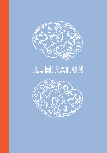
These are the resolved cover designs for the magazine (right) and book (left) I am happy with how they have turned out and feel that they work well in the range but are different enough to be recognisable as one or the other but enough the same so that people will know they are part of the same range 'illumination'.


Magazine editorial layout:
This is the format I am going to for my magazine layout. I want there to be lots of white space on the page so that the text does not feel overpowering. I want this magazine to be an easy but interesting read that allows the brain to think and wonder.

Bellow is how the layout works when filled in with images. I experimented with adding more visuals to the introduction page to the graphic design but I don't think it works as well as the simpler layout as in the right and bellow image the text has more room to breath and makes it easier to look at when reading.


These are the resolved cover designs for the magazine (right) and book (left) I am happy with how they have turned out and feel that they work well in the range but are different enough to be recognisable as one or the other but enough the same so that people will know they are part of the same range 'illumination'.

Magazine editorial layout:
This is the format I am going to for my magazine layout. I want there to be lots of white space on the page so that the text does not feel overpowering. I want this magazine to be an easy but interesting read that allows the brain to think and wonder.

Bellow is how the layout works when filled in with images. I experimented with adding more visuals to the introduction page to the graphic design but I don't think it works as well as the simpler layout as in the right and bellow image the text has more room to breath and makes it easier to look at when reading.


As the start of each interview is very basic I want to showcase the work of the graphic designer on the next spread, so that the interview can be put into the context of the work of the designer.
The layout will follow systematic rules such as the width between each image, and the placing of the designers name and website. This will add a coherent fluidity to the magazine. To stop the spreads for each designer looking to similar and repetitive I will use different sized and formated images.


No comments:
Post a Comment