Architecture & look up
I have been looking out how architecture is represented in graphic design. The below example has a really interesting perspective it gives such a real feeling go looking UP, it almost gives a dizzying effect. I am going to use this angle when taking photographs during my Look UP journey.
The above is an example using typography to represent architecture. this could be a concept that I could apply to looking UP make the typography represent the action. something to think about.
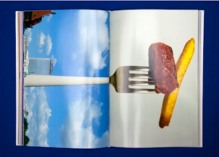
The above is a really clever concept of representing architecture. The use of com pining building with everyday objects to make something new is really striking and lovely. This type of design stands out a mile, it is clever and has a strong concept. This is what I want my design work to be like, I want it to be clever and concept driven as well as using strong design.


No comments:
Post a Comment