Tuesday, 21 May 2013

GOOD IS : Format / binds

book cover :

I think the way this book is backed is really interesting, it is very tactile, and unique looking. When I have hard back covered books before I have usual used hardback cover material, but using this method would mean paper backing the cover onto mount board the sticking this to the front inner page leaving a little bit of the binding tape on show. I want to use this bind in my project as it is a book binding method I have not used before.


Hotdog book :

This booklet is an example of a hotdog book. Hotdog booklets are a clever format that allows you to have a booklet, but also a poster in one. It's a good way to give your publication two functions. I want to incorporate this format into my design work as it will add more elements to the booklet I create. 


GOOD IS : RISO

Riso print would be how I would print my promotional goods, as riso is a cheap and cost effective way to print good quality aesthetically pleasing work and because it is cost effective it is perfect for events that are pop up as you don't want to spend loads and loads of money to print promo stuff for a lo-fi event that will last just one day.

It might be cost effective to print for events but for this project I will not be using the service as many riso services only do order in bulk and I don't think it is worth me forking out money to gets lots of leaflets that won't have a use after this module. But I am going to research into costs so that If I were to get it done I'd know the prices 

Catalogue Press :


Catalogue press run by the catalogue guys offer a riso service with 7 colour available. I contacted them to ask about their prices they offer. I asked about short runs to find out how much it would be what their minimum run is , the response was:

Minimum order is 20 
20 x A3 x 1 colour = 35 pounds
20 x A4 x 1 colour = 25 pounds

 Bellow is an example of a flyer they did for Village book store which is an example of the context I would get mine printed in - promotional material - flyers - posters


FootPrint:


Footprint is another printers in leeds that offer riso print. They have published their general pricings for riso on their website, but do state that every print job is different so this is just a guide. Their minimum run of copies is a lot higher then catalogue, which is interesting to see. It is also interesting to see the different pricings large jobs, compared to smaller jobs.


Colours :


The above colours are what I would use for if  I was getting my work riso printed. I wouldn't use all three it would be the blue, and either the pink or one of the opacities of the red, depending on which suits my colour scheme best.

GOOD IS : architecture

Architecture & look up

I have been looking out how architecture is represented in graphic design. The below example has a really interesting perspective it gives such a real feeling go looking UP, it almost gives a dizzying effect. I am going to use this angle when taking photographs during my Look UP journey.


The above is an example using typography to represent architecture. this could be a concept that I could apply to looking UP make the typography represent the action. something to think about.


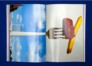
The above is a really clever concept of representing architecture. The use of com pining building with everyday objects to make something new is really striking and lovely. This type of design stands out a mile, it is clever and has a strong concept. This is what I want my design work to be like, I want it to be clever and concept driven as well as using strong design.


GOOD IS : maps

Maps -

I want to include a map in my dérive x Look UP pack as it would aid in knowing where you, not as a guide but as a way of getting your bearings. I myself, do not get along with maps, I find them confusing as there is so much going on on them. I want to create a simple looking map, and as it is not for the purpose of navigation, I will be able to simplify it without compromising it's function. I have done some research into maps that are lovely to look at.

Anymade studio :

The guide by any made studio is an example of a map done well, it is very striking looking, and is aesthetically pleasing. The map itself is done very simply which makes it easy to navigate and understand. this is the effect I want to have for my map, simple but easy to follow.


Poster :

I came across this poster by any made studio  (same as above) and I felt like I should blog it as it is a good example of using something that you see when you look up (roofs) in a poster design. The use of architectural style drawings is really beautiful as it is such skill. This would be a very striking way of highlighting what you see when you look up.


Map -


This is another really simple but effective map by any made studio again. It shows that with good design skill you can make something mundane like a mao, into something really striking and interesting looking.

Museum studio :


I really like the format of this book it is really simple but effective. The elastic band aids as the bind to hold all the papers together which works really well. The cover is changeable, there are different variations which makes this publication very flexible.

Kobi Benezri


This book is an example of a more complex map, which is what a  I want to avoid, but it has been executed well, so the the combination of map with the lovely typographic work, makes the map look a lot more approachable and less like a map. This has shown me that complex maps don't always come across as daunting.

Monday, 20 May 2013

GOOD IS : catch up


this is an even that happened in Leeds, I went to the evening shin dig exhibition and it was a really great success. The concept of having a two part exhibition is really interesting and might be something I explore for my own project. 


The venue of the exhibition was also really great , Mexico project space. It had a good relaxed fun vibe, they have a booze licence which also added a 'party' atmosphere.

From going to this event it has made me realise that the context for my exhibition is similar to this, not large gallery's like Leeds art gallery. I want my exhibition to be a pop up, lo-fi exhibition and this setting is really good for that kind of thing.


BRIEF 3 : visual research

Pageant posters:

To start off research I have looked into pageant posters, to see what they look like aesthetically. 
The pageant posters I have looked at are vintage ones, as I think visually they are more interesting, they have a classic, iconic look to them, where as I'm sure the ones today would be tacky and tasteless, which I will double check before I scorn them.

I really love the low quality of the posters, I want to try and represent this in my poster, so that it has an authentic feel and plays homage to the old beauty pageant posters but with a modern more simple feel.


Pageant queens :

I want to include imagery of pageant queens, so have collected a range of imagery which I will whittle down choose 7 pageant queens (almost like a pageant in itself) 


Modern day pageant :

I was right to pre-judge the posters for modern day pageants, they are very garish and 'bling' this is the exact design angle that I want to avoid. I will stick with the vintage feel pageant.