I really like the simplicity and structure to this website. I aslo like the use of columns I think it adds a sense of structure and usability to the website.
Interesting stripped to basics looking website. The amount of white space is really eyecataching as this is something that is rare in websites, it seems that everyone who designs nasty websites is allegeic to space.
Creative concept for a website, not the style I am going for in this project, but interesting to look at and bare in mind for future.
I realy love the look of this website it almost looks more like an app then a website but that in itself is quite interesting. I like the use of one colour it flattens the website and makes it very aesthetically pleasing.
Another grid layout to look at , as this is the direction I am taking my Fry website. This one works well, images are very clear and have optimised space and website is easy to navigate.
Different look of a gridded website this is more like a broken grid which is an idea I have had for the Fry website. The sporadicly placed images with the overlay of text gives a realy nice effect, very simple website but with a lovely aesthetic.
This website feels a bit too 'gridy' but it is interesting to see all the images piled so close together with a structure on a website. It is rare to see websites with no layout except for resting on each other.
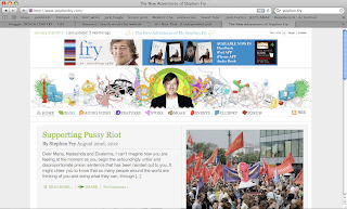
After looking at Fry's website I can stay two things, I don't like it and its very colourful and the images in the illustration are slightly crazy. Which makes me think that the more colourful I make my website the more it will represent Fry. So the way forward is the more the clash the better!
This website has an effect of the yellow boxes not only disapearing when you click on them, but fading ,dissolving. This is somethig I havnt seen before so find it quite exciting. I also like the monotone effect with the bright yellow it really makes the website stand out .
The colour and layout of this website is really nice I was automatically obliged to stay on the page and stare at it which means its a good website, as i didn't want to leave. The colour is really bright which would work with how I want to represent Fry. I will experiment with this in my DP
Catalogues website is an example of the the effect I want to have of clicking on +info and information poping up on the page anywehre you tell it to. I as of yet dont know how to do this but i will keep searching the web until I find the answer.


No comments:
Post a Comment